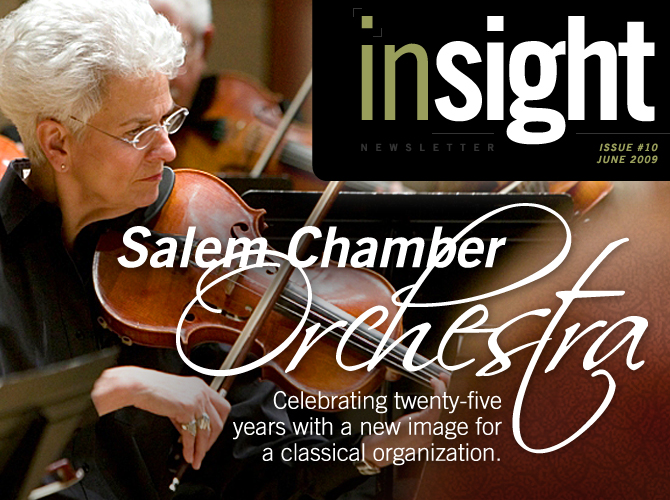
Salem
Chamber Orchestra
Salem
Chamber Orchestra was originally
founded in 1984 by Willamette
University Professor Bruce McIntosh,
as the Willamette Community Orchestra. Today, Salem Chamber
Orchestra (SCO) works in association with Willamette University
to provide a platform for local musicians, including university
faculty and advanced students, to perform for audiences in
Salem.
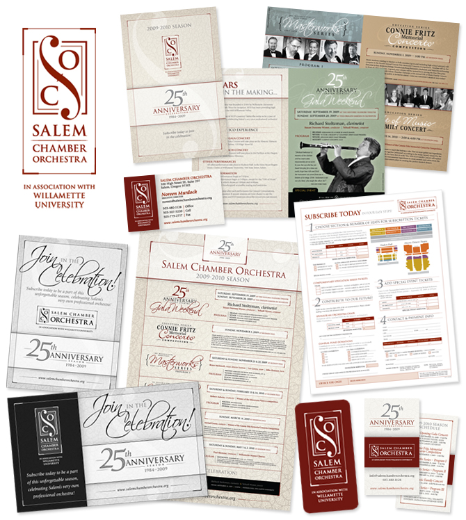
Looking ahead to their 25th season, SCO asked
DesignPoint to assist them with a new identity that would
give them a fresh and classy new look to commemorate their
silver anniversary.
We began working with Salem Chamber Orchestra shortly after
the start of their 2008-2009 season. What started as one
or two quick projects turned into a working relationship
that had DesignPoint developing most of their materials for
the rest of the concert season. We even had the opportunity
to attend some of the performances which provided us with
excellent inspiration for the pieces we were designing; postcards,
lobby posters, newspaper ads and more.
After working closely with Salem Chamber Orchestra last year
to enhance their marketing campaign, we were very excited
to help them with their new identity in conjunction with their
25th Anniversary Season.
We always try to take cues from the target industry whenever
we start to establish a look and feel for a campaign or logo,
and in this case we wanted to capture the feeling of classical
music. Salem Chamber Orchestra’s marketing group did
initial surveys of their musicians and staff to see how each
envisioned themselves and SCO within the community. They
had general findings which they wanted to emphasize and help
guide our initial designs. Ultimately they wanted us to blend
their thoughts with timeless design to create a truly professional
and classic logo that would work well in various applications.
In order to convey that classical style the final logo used
serif fonts, clean lines, solid colors and a stylized f-hole
element to represent the letter "S" of "SCO".
The f-hole image is a immediately recognizable element from
orchestral instruments such as the violin and cello, which
helps reinforce the connection between the logo and the orchestra.
As is our custom, we then began to apply the new identity
to all other materials in their campaign. Our biggest initial
project using the new identity was the season brochure, but
we have since developed envelopes, business cards, lobby posters
and newspaper ads incorporating the new logo. We are looking
forward to the rest of the 25th Anniversary Season celebration
and we hope you will find time to catch a performance. They
are truly amazing artists.
Some new materials for Salem Chamber Orchestra... |